A histogram is simply a graph that samples a population and shows a count of each characteristic of interest.
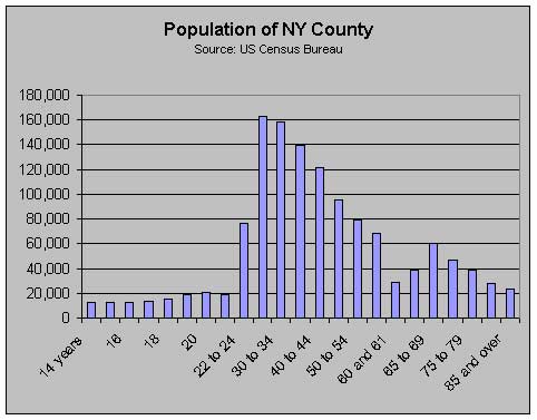
In this case we're interested in the population of New York County counted by age. This graph displays the number of individuals resident in New York County by age from the 1990 census. The abrupt increase in bar size after the 20-year-old category is because the subsequent bars encompass more than one age group. Also there is no bar for those under 14 years.
This graph is different from that of one for an isolated population with a stable birthrate, where from a starting peak the age groups decrease in number as members die, in that the 18 to 34 age groups show increases. What the graph does not say is that the increases are traceable to foreign immigration and net inflows US citizens seeking employment in New York County.
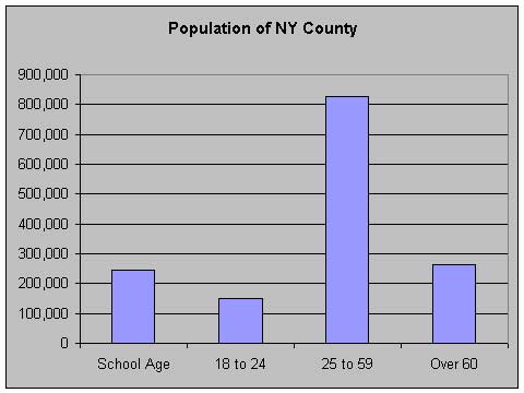
Another way of designing a histogram is to aggregate the samplings into more meaningful categories for making policy decisions. We might be more interested in age groups such as those in high school, of college age, in prime income-earning years, and of retirement age. For example, in the previous graph, the categories 19, 20, or 30 to 34, while not particularly interesting in themselves, could be combined and shown as:
Sometimes we're not so interested in absolute numbers as much as relative sizes, that is we want to know what proportion a particular category is to the total population:
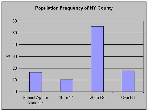
This is also known as a frequency distribution. It shows, among other things, that the 25 to 59 age group comprises 55% of the population of the county. Now, suppose we want to compare Los Angeles County with New York County:
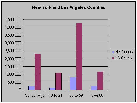
This is of interest in showing that in absolute numbers, LA County has more population in each of the four age groups. But by making the chart a frequency distribution instead
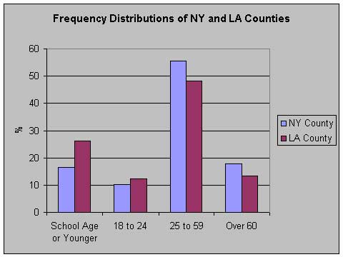
we can see that LA county's population is relatively younger than New York County's. (By the way, New York County is the island of Manhattan only.)
Now, let's look at a different frequency distribution:
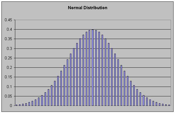
Some distributions, such as the normal distribution, have the characteristic that arbitrarily small sampling intervals can be defined. As we make the intervals smaller and smaller, eventually the bars run into each other, creating a solid appearance:
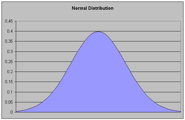
When you see a graph like this, just imagine that every point on the curve sits atop a tiny "bar" or "stick", and the visual effect of these sticks makes for a solid area. (The abiding imagery in my mind comes from high school when we cut lengths of uncooked spaghetti to represent values.) This is something that will be seen repeatedly in evaluating image histograms. In addition, the image histograms you will see are frequency distributions.
It is hard to overstate the importance of graphs in today's society. For the modern bureaucracy, business or government, they are the staff of life.
![]()